Welcome to the
Run on Sun Monthly Newsletter

In this Issue: |
December, 2018
Volume: 9 Issue: 12
|
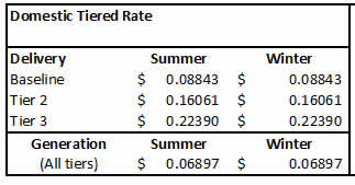
2018 was a tumultous year, including tariffs and equipment shortages, that at times made the task of simply installing systems in a timely manner far more challenging than it should have been. As we head into 2019, we thought we would recap our top three most read articles this year—although two of them harken back to prior years, thereby proving that meaningful content can truly be evergreen. Thanks to all for their support, to family and friends, but most of all to our clients, who are the reason we do this everyday. Happy New Year! Understanding Tiered vs TOU RatesEDITOR'S NOTE: This article, first written in October, 2016, was viewed over 2,000 times this year. While the rates have changed in terms of actual dollars and cents, the underlying premise still applies. Contact us if you would like to see how simply changing your rate in SCE territory could save you money in the New Year! A client of ours noted that Pasadena Water and Power (PWP) offers, in addition to its regular, Residential tiered rate structure, the option to switch to a Time-of-Use rate structure, and he asked if he would derive additional savings from making that switch. Turns out that is not an easy question to answer, and there certainly isn't a "one size fits all" result. We decided to take a closer look into these rates both for PWP and for the folks in Southern California Edison (SCE) territory. SPOILER ALERT - The following is pretty much down in the weeds. Defining Tiered and Time-of-Use (TOU) RatesLet's start by defining our terms. Most residential electric customers, of both PWP and SCE, are on a tiered rate structure. That means that there are two or more cost steps - called tiers - for the energy that you use. Tiered rates assume that there is some minimally expensive charge for the first allocation of energy per billing cycle, and that as you use more energy your cost for energy increases. For example, SCE's Domestic rate has three tiers and in the first tier the charge is 8.8¢/kWh, in the second tier the charge is 16¢/kWh, but the final tier is 22.4¢/kWh! (There is also a non-tiered component that adds another 6.9¢/kWh to the customer's bill.) PWP, on the other hand, has a somewhat perverse tier structure in that the lowest tier is very cheap, 1.7¢/kWh, the second tier is significantly higher, 13.5¢/kWh, but the final tier actually goes down to just 9.9¢/kWh! Since the whole point of tiered rates is to provide an incentive for heavy users to reduce their usage, PWP is actually rewarding those who consume more than 25 kWh per day with lower rates! Very odd. Time-of-use rates, on the other hand, are generally not tiered. Instead, the day is broken up into segments and the cost of energy varies depending on the segment in which it is consumed. PWP refers to these segments as "On-Peak" (from 3-8 p.m.) and "Off-Peak" (all other hours). But PWP's TOU rate retains the tiered element as well, making it a truly odd hybrid rate structure. SCE's approach is more involved, dividing the day into three, more complicated segments: "On-Peak" (2-8 p.m. weekdays - holidays excluded), "Super Off-Peak" (10 p.m. to 8 a.m. everyday), and "Off-Peak" (all other hours). For both PWP and SCE there is a seasonal overlay on these rates, with energy costs increasing in the summer months (defined as June 1 through September 30). (It is important to note that both PWP's and SCE's TOU rates put the most expensive energy in the late afternoon to evening time period - pricing energy to offset against the "head of the duck." Ultimately, these rates will create the energy storage market in California, but that is a post for another day. Analyzing the Benefits of a Rate Switch - Pre-SolarAssuming that one can create a spreadsheet to model these different rates (not a small task in and of itself!) there is one more hangup - data. Both PWP and SCE report total monthly usage to customers on their tiered rate plans - but in order to analyze your potential bill under a TOU rate, you must have hourly usage data for every day of the year! (Because there are 8,760 hours in a [non-leap] year, such a usage data collection is typically referred to as an 8760 file.) The standard meters that PWP has installed simply do not record that data, so the average PWP customer has no way to know whether they would save money by making the switch. On the other hand, most SCE customers do have access to that data and they can download it from SCE's website.
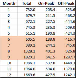
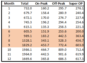
Modeling PWPGiven that PWP doesn't have data available, is there any way to estimate what the results might be? The answer is, sort of. We took an 8760 data set from an SCE customer and used that as our test data for both PWP and SCE. (The data file does not identify the customer.) Since the data file has an entry for every hour of every day, we can segment the usage against the On-Peak and Off-Peak hours, and using a pivot table - probably the most powerful took in Excel - we can summarize those values over the course of the year, as you see in Figure 1.
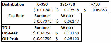
Beyond that, PWP has a number of other charges - such as a public benefit charge, an underground surtax, and a transmission charge - that are only tied to total usage, so the ultimate difference between these two rates is even smaller. Modeling SCESCE rate structures are significantly more complicated that PWP's. For example, the tier 1 (aka baseline) allocation varies by location. Since SCE covers such a huge and diverse area from cool coastal regions to absolute deserts, customers are allocated more energy per day in their baseline depending upon where they live. In the area around Pasadena that is covered by SCE, a typical daily baseline allowance would be 13.3 kWh in the summer and 10.8 kWh in the non-summer months. The baseline then is that number times the number of days in the billing cycle. Tier 2 applies to every kWh above baseline, but below 200% of baseline. Tier 3 applies to everything beyond that. As with PWP, the tiered rate only applies to "delivery" charges. The energy generation charges are the same all year. Here's what that rate structure looks like:
So what would happen if this beleaguered client were to shift to a TOU rate? First, we need to re-parse the usage data according to SCE's more complicated segmentation scheme, which gives us Figure 4:
Option B deletes that baseline credit and replaces it with a "meter charge" (even though it is the same meter!) of 53.8¢/kWh/day, or roughly $17/month. In return, the On-Peak charges are significantly reduced from 44¢/kWh to just 32¢/kWh. So how does this shake out? The results are quite surprising, as shown in Figure 5.
The two left columns show the month-by-month calculations for both delivery (the tiered component) and generation (the flat component). The two right columns show the month-by-month calculations for the two different TOU rates. The bottom line is striking: under TOU-A there is a savings of 5% over the tiered rate, whereas the savings jump to 19% by going to TOU-B! That is a savings of $600/year just by changing rate plans - a switch that any SCE customer can make. MAJOR CAVEAT: YOUR MILEAGE WILL VARY! The results displayed here are entirely dependent on your actual energy usage and no two usage profiles are alike. It is possible, even likely, that some usage profiles will see an increase in bills under either TOU option. The good news is, that for a nominal fee, this is an analysis that we could do for any SCE residential customer - we would just need access to your usage data. So that completes our pre-solar analysis. In our next post, we will look at how these results change when you add a solar power system into the mix. |
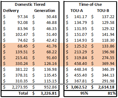
“The bottom line is striking: under TOU-A there is a savings of 5% over the tiered rate, whereas the savings jump to 19% by going to TOU-B — but, your mileage may vary!”

Get your copy of
Commercial Solar:
Step-by-Step
from
Run on Sun
Founder & CEO
Jim Jenal

Now available on Amazon.com
in both
Print & Kindle versions.
Commercial Solar:
Step-by-Step
from Run on Sun
Founder & CEO
Jim Jenal
Now available on Amazon.com
in both Print & Kindle versions.
Help Us Spread the News!


|
EDITOR'S NOTE: Our second most read article, having been viewed over 7,000 times in just five months, had the highest ever views of any post in its first week—more than 2,600 views! This reveals the power of a timely post on a topic of broad interest, in this case, the pending release in 2019 of the IQ8 and the Ensemble platform. To say we are eager to get our hands on this would be a massive understatement! What I Saw at Enphase - Mind Blown!
(This is to prevent your house from being an island of energy, feeding the grid, and potentially injuring a worker trying to restore grid service. As a result, this feature is known as "anti-islanding" and it is required of all inverter systems that are connected to the grid.) Normally this is not a problem, but last month, when it got super hot out here (think 115° F hot!), both SCE and LADWP suffered dozens of outages, taking down PV systems across large swathes of LA County, and leaving frustrated PV owners without power, or A/C, just like their PV-less brethren. Not good. What I Saw in the LabWhich brings us to what I saw at Enphase last month. The lab looked like an ordinary industrial space, but with a series of household appliances and tools at one side. There was a simulated array feeding a bank of IQ8 inverters, and a display that showed the output of the array (i.e., PV production), the total consumption from the loads, and any power being exported or imported to support those loads. At the start of the demo the only load was a single red lamp, and the display indicated that it was drawing roughly 90 Watts. The PV array was producing roughly 1.9 kWs, so the excess 1,800 Watts was being exported to the grid. All super normal stuff. But then things got interesting... One of the engineers switched off the breaker that connected the PV array to the grid... and nothing happened! Well, actually, a lot happened, but what didn't happen was that the red light did not go off. It didn't even flicker to the extent that we could detect it. But then when you looked at the display you noticed something amazing. Not only had the microinverters created a grid on their own in fractions of a second, but they had throttled the output down so that now the production of the PV array exactly matched the load of the red light! And here's the kicker - there were no batteries attached to this system!!! But what fun is just having a light on? How about some toast? So they switched on a toaster, and it lit up, and the total load jumped by about 1,000 Watts, making the total load now around 1.1 kW, and the PV array scaled up to meet it! Still no batteries. And how about this - there was no central controller, no master-slave relationship between the microinverters. Rather, this was the "hive mind" at work, as the micros sensed the demand and scaled up or down as necessary to meet that load! But wait, there's more! The next load to be added was a grinder like you might find on your workbench in the garage. All by itself, that device drew roughly 1,200 Watts, bring our total load to roughly 2.3 kW - more than the maximum output of our simulated array. What would happen when that was added to the mix? Surprisingly little. The grinder spun normally, but the red light dimmed slightly. What was going on? The system's "hive mind" had lowered the voltage slightly (a microgrid equivalent of a brown out) to meet the amperage demand of the new load mix! So slightly slower than normal, cooler than normal, dimmer than normal, but all operating. Of course, all good things must come to an end. Our already overloaded microgrid faced one more challenge - a vacuum cleaner with a significant in-rush current, far in excess of what the grid could sustain. Indeed, as soon as they switched the vacuum cleaner to "on", everything shut off. Nothing was damaged, the microinverters just shut off to protect themselves. Turning on the vacuum cleaner served as the "ah-ha" moment for the potential homeowner - I guess I can't run everything in grid outage mode. So what do you do when something you just did produced an undesired result? Well if you can, you undo it! Turning the vacuum cleaner off, immediately restored the microgrid to its previous state of operation! No delay. No human intervention - just turn off that latest (over)load, and the system recovers on its own! How cool is that? Pretty damn cool, if you ask me! Batteries Please?So what about batteries, how do they play with this new system? Just exactly as you would want. The engineers added a bank of batteries to the mix, each with an IQ8 installed. Now the display also indicated the battery's overall state of charge, and whether they were charging or discharging. Reset the demo to just the red light as a load and the batteries at 30% state of charge. The PV array output jumped back to its maximum, with the surplus energy being used to charge the batteries. As more loads were added, the PV array remained at maximum output, and as needed, drew power from the batteries. Should the batteries reach full capacity and the PV output is greater than the loads, the microinverters will once again throttle down. Sweet! What's Next?I hope you agree that this was an amazing demo, and the IQ8 (or Ensemble, as Enphase refers to the overall system) has tremendous potential, both for Enphase as a company, and for so many nascent markets. Think of how this product could have helped out in Puerto Rico, or in parts of Africa which have never, ever seen a grid! Makes me want to book a trip to bring power to a village somewhere - hey Laurel, what do you say? For our own clients, this has the potential to be the answer we have been seeking ever since Elon's whoppers got people thinking about storage for the first time ever. A point we raised with Enphase management is the need to have a reasonable upgrade path for existing clients. Indeed, I have a call with Enphase tomorrow to discuss that very topic. We know that current Enphase IQ products (the 6+ and 7+ we have been installing this year) will be compatible with Ensemble. We expect to be able to work with older systems, though there may be a higher retrofit cost. When we have that information, we will surely let you know! The IQ8 is expected to be available in 1H2019... watch this space! |

|
EDITOR'S NOTE: Our most read article, having been viewed over 14,000 times, is a testament to the power of Google to drive traffic. When this article was first written in February of last year, it drew only modest traffic. That is until Google decided that this was a story worth noticing, and the Google-driven views jumped from 1,400, to over 13,000 this year! If only we could do that with every post! I've got solar; why is my bill so high?
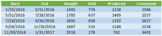
Your system just isn't working!Although this tends to be the number one suspected reason for why the bill is so high, generally it isn't the actual cause. Most systems are installed properly and are in operation. But every now and then we come across a system that simply isn't working at all. That was the case with one man who was convinced that his system had never worked and that the company that installed it was simply out to cheat him. We didn't see signs of that—the system had been installed and the overall workmanship was acceptable on the surface, so it wasn't like someone just slapped the panels on the roof and ran away. But here's the thing—this was an Enphase system so there should have been monitoring in place to answer the question of how well the system was working. Except that the installer had never bothered to complete the setup of the monitoring system! When we came out we were able to access the Envoy directly, and while it could see the microinverters, it was clear that they had never produced any power—in over a year! So how can a solar system owner prevent this? Simple—when your system goes live, make sure that the installer walks you through the operation of the system so that you can see with your own two eyes that the system is actually producing power. (This could be a readout on the inverter/monitoring system, or a spinning performance meter, or an indication that utility meter is going backwards.) Better yet, ask them up-front how will you be able to know that your system is working, and then when it goes live, make them prove it to you! If you believe that your system isn't working, and you live in the greater Pasadena area, give us a call at 626-793-6025, or email us to set up a service call! Your system is working, but…This second case is actually far more likely: the system is performing, but it is not meeting your savings expectations. In our experience there are two main reasons for this: hype and over use. Beware the hypeOne reason for this disconnect is that a dishonest sales person over-hyped the savings to be had from the system installed. For example, we have seen "savings" projections based just on the size of the system, without regard for how shaded the system was, or its orientation - to say nothing of the actual rate structure that is being used by the utility. Shaded systems produce less energy. Systems aligned away from South will produce less energy. A utility customer on a time-of-use rate structure may well save less than one on a tiered rate structure (depending on how those rates are designed). The point is to beware of overly simplistic savings projections. A proper analysis will factor in all of these issues to provide the best possible estimate of savings. Solar is not a silver bulletEven the best savings projection is predicated on future energy usage being consistent with the historical data that the solar company was given (unless increases are specifically discussed and included). While many people with solar power systems become vigilant about reducing their overall energy consumption, others go in exactly the opposite direction. Indeed, it is not uncommon to hear people say that part of why they want to "go solar" is so they can afford to run their air conditioning "more" during the summer. Solar power systems are finite resources—they can only produce so much energy consistent with the size of the system, and most utilities limit system size to the historical energy usage average at the site. If you install solar, but then triple how much energy you use during the year, you shouldn't be surprised if you are not saving any money! What we have here is a failure to communicate!Which leads us to the most likely culprit—there has been a failure to communicate between installer and consumer. At the root of this is Net Metering and the complexities of most energy bills. (A big part of the blame here goes to the utilities who seem determined to make their bills as complicated as possible!) Let's provide an overview of this issue and then illustrate with a specific example. How Net Metering WorksSolar system owners - at least here in SoCal - operate under utility rules known as Net Energy Metering, or just Net Metering for short. Here is how this works: on the day when your solar power system is given "Permission to Operate" (or PTO) by the utility, your billing will shift to Net Metering (often the utility will change your meter to allow for that switch). Every day, as your system operates, you will either be exporting (selling) energy back onto the grid, or importing (purchasing) energy from the grid. Think of it this way: you get up at 6 a.m. and it's dark outside. You turn on some lights, the radio, coffee maker, etc. Your solar system isn't producing anything (it's dark outside, remember?) so you are purchasing energy from the grid. You go off to work as the sun comes up, and your system turns on. All day long, your solar system is producing energy, but there is no one there to use it—the A/C is off, the TV is off, the house is dark—so all of that excess energy is sold back to the utility. Your fancy new meter keeps track of all of that energy coming and going. Every billing cycle the utility will look at those readings—how much energy did you sell compared to how much did you purchase—and "net" out the difference. If you were a net seller of energy, you will have a credit. If you were a net purchaser of energy you will have a balance due. But here is where some people get confused—your bill won't ask you to pay for the energy you used that month. Typically you will only be charged for whatever "customer charge" there may be along with taxes and other fees. The bill for your energy usage (or credit, if you are so lucky) is carried forward to the next billing cycle, and the next, and the next, until you get to the anniversary of your PTO date. Now your usage will be "trued up" and you will either get a bill to pay (assuming that for the year you were a net energy purchaser) or a check (assuming you were a net energy seller, but don't get too excited because that payment is really tiny). Here's the thing, depending on how much of a net energy purchaser you were, that bill could be pretty significant, in some cases well over a thousand dollars or more! Of course, you would have been receiving bills every cycle that showed what you were accumulating (either a balance due or a credit) but since there is no related payment required, it is easy for some to overlook those bills, and if this process has never been explained—or even if it was but the consumer simply didn't "get it" at the time—this can lead to a nasty surprise. Bottom line - solar companies need to do a better job here in explaining how this works. (Hence this post!) A real-life exampleConsider a hypothetical solar system owner, let's call him Bob. Now Bob is a smart guy, but this is the first solar power system he has ever owned. His installer explained everything to him when the system went live, but Bob was distracted by the excitement of a potentially zero bill. His system has Enphase microinverters so he has been receiving energy production emails from Enphase every month, and that looked cool, but he never attempted to reconcile his Enphase report with his utility bill (Bob's not so big on balancing his checkbook, either). But to be fair to Bob, the Enphase report that he receives is for each calendar month, but his billing is every two months, and they aren't calendar months; rather, they run from meter read date to meter read date (e.g., 7/28/2016 to 9/26/2016). The good news is that Enphase has a reporting feature that allows you to enter any two dates since the system went live and receive day-by-day energy production, with the total at the end. Let's see what we can learn when we put Bob's billing data next to his production data from the Enphase reporting feature:
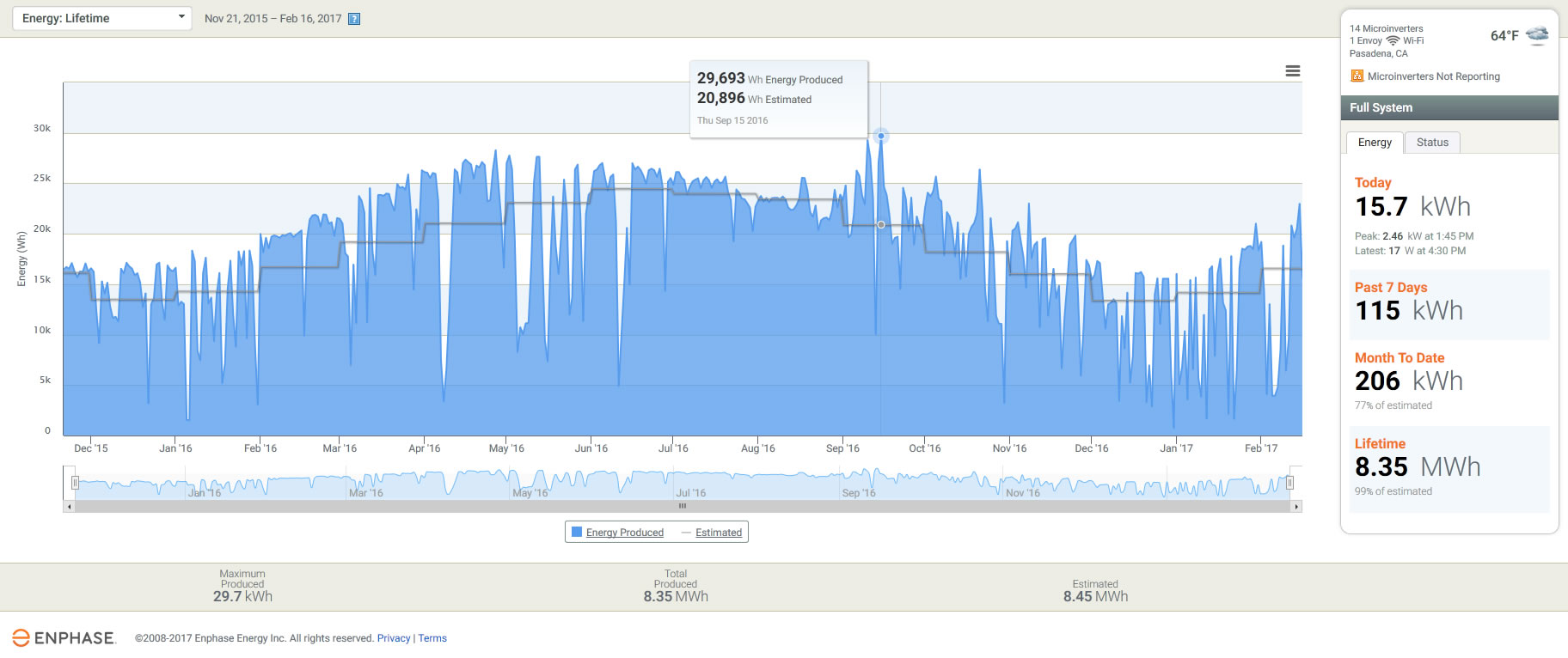
The first two columns show the start and end dates for each meter reading/billing cycle. The bought column is the amount of energy that Bob purchased from his utility. (Whoa, what happened during the latest billing cycle???) The sold column is the amount of energy that Bob sold back to his utility during that period, as reported by the utility. The next column is the amount of energy that Bob's system produced during the dates in the billing cycle, according to the Enphase website. But wait, how can this be? In that first period, the utility says that Bob only sold 774 kWh of energy, but Enphase says his system produced nearly twice as much, 1,338 kWh! How do we make sense of this disparity? The answer is simple: local consumption. It is important to remember that the utility has no idea how much energy Bob's system is producing, all they see is how much energy Bob is selling back to them. So both Enphase and the utility are correct, they are just measuring different things. Enphase measures total energy produced. The utility measures energy sold to them—the difference is energy used to power Bob's house that didn't come from the utility; rather, it came from the solar system! In that first billing cycle, Bob's system produced 1,338 kWh and of that, 774 kWh were sold back to the utility, meaning 564 kWh of that production were used to power his house. And that means that Bob's total consumption for the month is the amount that he bought from his utility, 1,402 kWh, plus the solar production that was consumed locally, 564 kWh, for a total consumption of 1,966 kWh. Applying that reasoning to the rest of the data shows that Bob's overall consumption has increased in every billing cycle except one, with a whopper over the holidays! (Maybe too many holiday lights?) The production data shows that Bob's system has been performing appropriately - increasing over the summer months, decreasing over the winter months. Here's a graph that puts that all into perspective:
The blue represents the actual energy produced each day. The gray line is the predicted system production (in this case modeled using the CSI calculator). Over the lifetime of the system, the maximum amount of energy produced in a day was 29.7 kWh (42% above what was predicted for that day) and on the day when this graph was created, the system produced 15.7 kWh. Generally, the performance peaks well above what is expected (particularly in the late June through early November period). But once we get into mid-November things deteriorate—not because of a fault in the system, but because of abnormally wet weather here in SoCal (as we head into a 1"/hour rain storm today!). For much of the past two months, actual production has fallen well below what was predicted, with just 77% of predicted being realized so far this month. And yet, despite all of that, overall the system has still produced 99% of its estimated lifetime production. This points out a couple of key things to me: First, you just gotta love the data that is available through the Enphase monitoring system. It allows system owners and installers alike to have near-real time access to system performance, as well as to review long-term data to discern trends and uncover patterns. Priceless! Second, we as solar professionals need to do a much better job of informing our clients so that they know what to expect. (I'm leaving out the hype-sters who couldn't care less what the consumer knows as long as they make a sale.) We live with this stuff every day but for most of our clients, this is all brand new, and confusing. We need to take the time to explain how this works so that they can understand the actual value of their investment. |